
![]() Caoscreo e i colori sgargianti anni '80 trad (1)
Caoscreo e i colori sgargianti anni '80 trad (1)
44KB
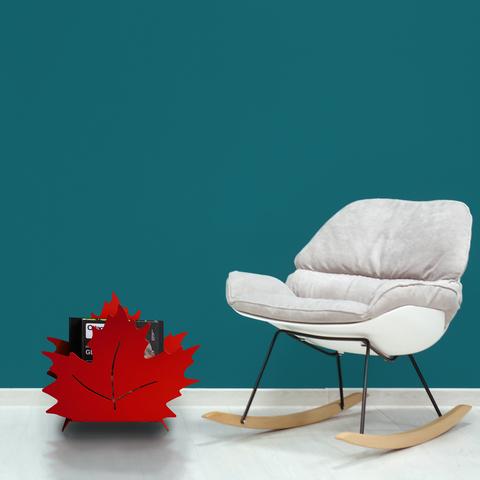
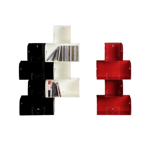
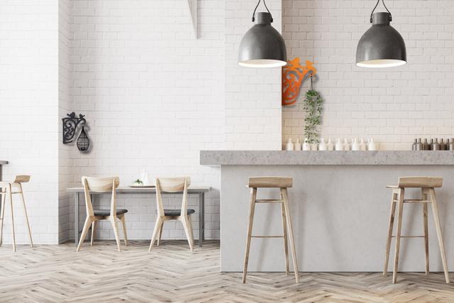
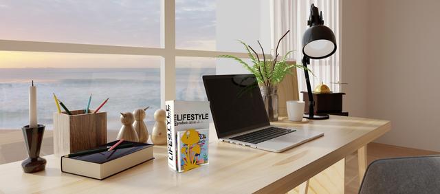
Two furnishing elements with bright colors that symbolize life - fuchsia and orange, the one in its brightest and most vivid color, united under the #caoscreo brand that shapes the metal, works it with two-dimensional and three-dimensional shapes, laying it on a minimal and functional style that fits perfectly into the interior ...
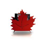
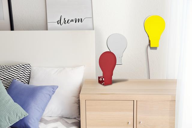
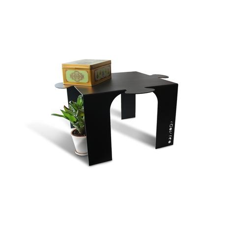
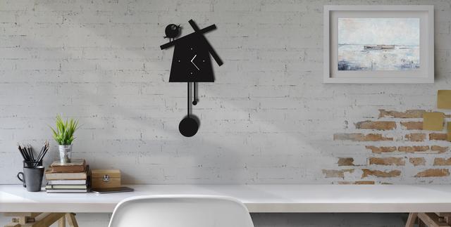
Fuchsia Puntable, #design by Adriano Giannini, coffee table that recalls with a certain sympathetic fidelity the three-pointed drawing pin, follows a circular shape and is especially suited to the function of a support surface for magazines or coffee breaks, or even a table for dining rooms and for receptions, even better if convivial with guests in the living room ...
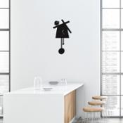
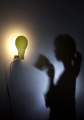
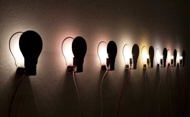
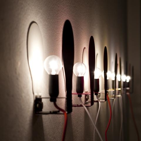
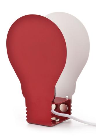
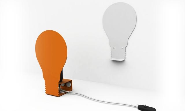
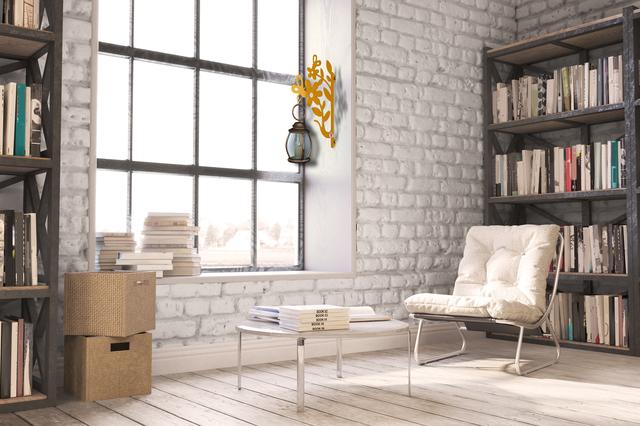
Orange Square, a lamp that hides an "extraordinarily" twentieth-century line, complete with a "stitching effect" obtained through laser processing and the colored fabric cable to give a "specific tailoring" to this object with an essential, square shape and dedicated to lighting so apparently retro for how it is built, which suggests a bedroom setting for a studio light, a table light, almost in an evening setting ...
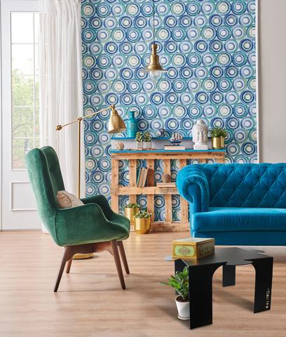
The Bright "Fluo" Colors of the 80s are Back to Regain Possession of Life
So vintage takes back its space but this time we are no longer talking about the 20s, 50s or 60s, the most celebrated decades, but directly the 80s, which many can remember as years of youth and well-being that it was breathed in the West. The decade of hedonism and Reaganism, therefore of individualism, in which customs changed in a broad sense and strong colors, "Fluo", showy, chosen on purpose not to go unnoticed, dominated the fashions. And not only taken individually but also, through what is called color-blocking, the combination of one-colors apparently in contrast to each other; the colors that were most popular were electric blue, acid green, turquoise, fuchsia, fluorescent yellow ...
Fashion was segmented by marking different trends rather than a dominant unitary style, with Italian prêt-à-porter and the Milanese “school” on the rise, and visual culture also dominating the musical arts. As if today regaining possession of these colors also wanted to symbolize a return to "attacking life" after the summer, without waiting passively for it, to dynamically recover the difficult months we have left behind.

Puntable Caoscreo per Lulop
![]() 3543x2126, 198KB
3543x2126, 198KB
Square Arancione per Lulop
![]() 1501x1000, 358KB
1501x1000, 358KB
![]() Caoscreo e i colori sgargianti anni '80 trad (1)
Caoscreo e i colori sgargianti anni '80 trad (1)
44KB
Related news |
||

|
|

|
october 11, 2023
|
september 12, 2023
|
august 29, 2023
|
|
After talking about basic colors in #interiordesign, it is the turn of the autumn color palette.Hues with an amber, almost warm un... |
Autumn follows summer and precedes winter, that season in which the days slowly become colder and the leaves change as they fall f... |
Hi-tech for the Interior. Not just ArchitectureHi-tech is an architectural style that developed a lot in the late seventies. Today... |
You might be interested in |
||
|
|
|
august 24, 2023
|
july 05, 2023
|
june 20, 2023
|
|
Often associated with clothing and make-up, color harmony is a discipline that studies how to best enhance ourselves through color... |
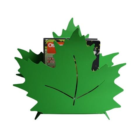
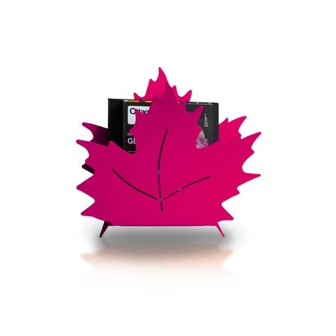
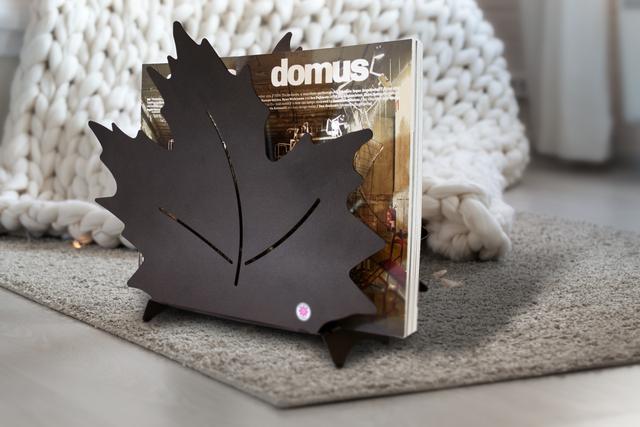
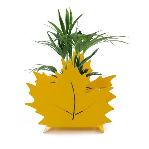
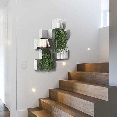
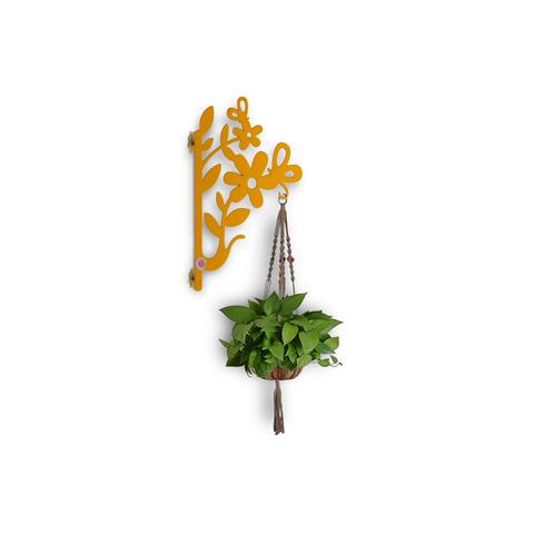
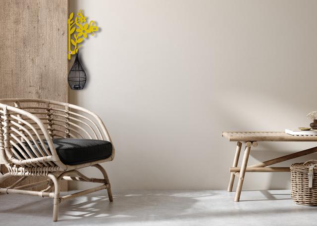
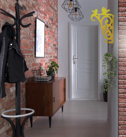
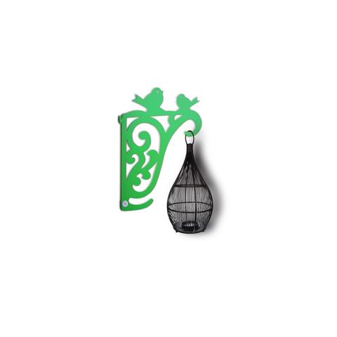
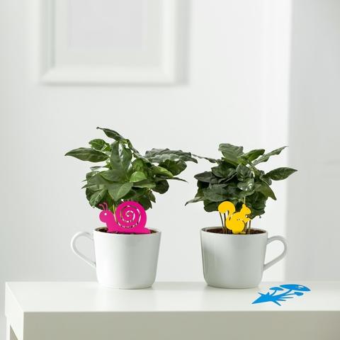
Would you like to give a #green note to your home?CAOSCREO has thought of a series of furnishing accessories inspired by nature, m... |
June, the month that means the end of spring and the beginning of summer, a period in which we free ourselves from a sedentary lif... |
© Copyright 2024


 Italian
  Share
Share Share via mail
  Automotive
 Sport
Sport Events
 Art&Culture
 Design
 Fashion&Beauty
 Food&Hospitality
 Technology
 Nautica
 Racing
 Excellence
 Corporate
 OffBeat
 Green
Green Gift
Gift Pop
Pop Heritage
 Entertainment
 Health & Wellness